Introduction
An adaptable content management system (CMS) layout is crucial for every organisation in the fast-paced modern world. Your website can adjust to various screen sizes due to a responsive CMS style, which makes it easier for users to view your content on any screen. Several steps you must take to create and build a responsive CMS layout that will give your audience the greatest user experience are explained in this article.
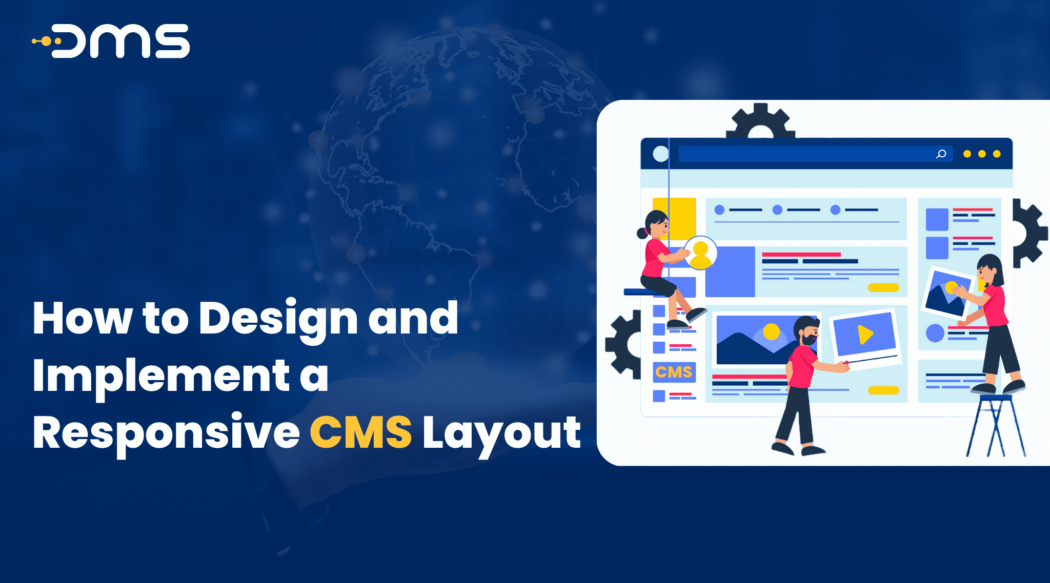
What is a Responsive CMS Layout?
Websites built with an interactive CMS can be resized to match many screen sizes, including those of PCs, laptops, tablets, and smartphones. According to the screen size of the device that is being utilised to view the website, this method changes the layout and content of the website using a flexible grid system and CSS media queries. A responsive CMS layout is a design approach that aims to create websites that can adjust to different screen sizes, including desktops, laptops, tablets, and mobile devices. This approach uses a flexible grid system and CSS media queries to change the layout and content of the website based on the screen size of the device being used to access it.
Benefits of a Responsive CMS Layout
There are several benefits of having a responsive CMS layout. The fact that it offers a flawless user interface across all platforms is one of the main advantages. No matter what device users are using, they can simply access your content, which can increase conversions and enhance engagement. A responsive CMS layout also improves your website’s SEO because Google prefers mobile-friendly websites and ranks them higher in search results. Additionally, a responsive CMS layout is easier to manage because you only need to update one website instead of creating separate websites for each device type.
Steps to Design and Implement a Responsive CMS Layout
Now that you understand what a responsive CMS layout is and its benefits, let’s discuss the steps you need to take to design and implement one for your website.
Step 1: Choose the Right CMS Platform
The first step to creating a responsive CMS layout is to choose the right CMS platform. There are many CMS platforms available, such as WordPress, Drupal, and Joomla. Each platform has its strengths and weaknesses, so it’s essential to choose one that meets your needs and goals. For example, WordPress is an excellent choice for beginners because it’s easy to use and has many responsive design themes and plugins available.
Step 2: Understand Your Audience and Goals
The next step is to understand your audience and goals. You must be conscious of your target audience, the devices they use to access your website, and the intentions they have in mind. This information will help you create a responsive CMS layout that meets their needs and expectations.
Step 3: Plan Your Layout
Planning your layout comes when you are aware of your audience’s needs and objectives. You have to select the number of columns, the navigation layout, and the placement of your content. Keep your layout compact and clear as a general rule. Also, your layout ought to be adjustable for different screen sizes.
Step 4: Create a Wireframe
To make sure that your layout is simple to use and that the content is simple to find, you must build a wireframe. You may develop a wireframe quickly and simply through the use of a number of wireframing tools, like Figma, Sketch, and Adobe XD.
Step 5: Choose the Right Design Elements
Choosing the appropriate design elements occurs after you have built your wireframe. This includes selecting the right fonts, colours, and images that align with your brand and appeal to your audience. It’s also essential to choose design elements that are responsive and will adapt to different screen sizes.
Step 6: Test Your Design
The very last step is to test your design after it’s been completed. In order to make sure that your website loads correctly and that the style and content are simple to navigate, check your design on multiple devices. You can use tools such as Google’s Mobile-Friendly Test or Browser Stack to test your website on different devices and browsers.
Conclusion
To sum up, any company or organisation that wants to give its audience the greatest user experience must create and use an interactive CMS layout. The steps discussed in this article may assist you in creating an adaptable CMS layout that is simple to use and adjusts to different sizes of screens. Remember to choose the right CMS platform, understand your audience and goals, plan your layout, create a wireframe, choose the right design elements, and test your design. Your website’s interaction, conversions, and SEO will all improve due to a responsive CMS design.